
1. Atom Artwork
See Icon
Contribute your suggestions here, Place a note if something is obvious plagiarism.
1.1. General Selection and Design Criteria
[JeremyGray] A few notes (and these are not specifically directed at your work, just general comments I happened to think of while writing):
-
we'll want both colour and black & white representations
-
colour versions will, optimally, be friendly to colour-blind persons
-
it may be desirable to have both a logo and a logotype (using your example, perhaps a version of the "o" in "Atom" that is larger and stands on its own without the surrounding "At" and "m")
-
we'll need to ensure that any fonts used are either:
-
properly licensed
-
specifically created for use by this project
-
we'll need to be aware of things like
![[WWW]](/moin-1.2.1/wiki/htdocs/classic/img/moin-www.png) AtomFilms and other "atom"-related entities and their trademarked logos and logotypes
AtomFilms and other "atom"-related entities and their trademarked logos and logotypes
1.2. Our Logo Treatments
[TimBray] I think there should be a textual version of the logo. Almost every font has U+00D8, O-stroke, ø. So you'd write Atøm. Or in HTML, AtØm, or Atøm. Downside: People from Denmark would make a horrible strangled sound when reading this phonetically.
-
[ArveBersvendsen] Living in a country where ø is a common letter, I find this to be a horrible idea.
[PhilWolff] Should we design version numbers into the Atom badge? Atom 1.0.
[ArveBersvendsen, RefactorOk] My suggestions for Atom Artwork.  ,
,  ,
,  , and an antipixel-style button:
 ![]() , Valid Atom!
, Valid Atom!  -- please Note that hotlinking to these images from anywhere but this wiki is impossible. If you want to use them, download
 ![]() the zip-bundle
the zip-bundle
-
[JeremyGray] Great minds think alike.
-
The font is Arial Black. (Some software has installed it on this computer, but I don't know which). The font is from The Monotype Corporation.
-
The "o" has many possibilites for variation. This particular version was created by drawing an ellipse with height-width ratio of 2:1, with the blue proton in the middle, and the red electron at 90 degrees; - the entire image is then rotated 45 degrees clockwise; - I can very well imagine someone creating a 3d version resembling this.
-
The colors used for the proton and electron are: hsl(225,60%,40%) and hsl(0,50%,60%). The path the electron follows is something like hsl(0,0%,18%)
-
I looked around the web for similar logos, but found nothing that matched. Neither the
AtomFilms and Atomz Search logos resemble this.
-
Why the hydrogen atom? Well, it's simple, works as an icon, and is highly reactive

[ArveBersvendsen, RefactorOk] If people like this logo, it's simple enough:
[DeveloperDude, RefactorOk] I would avoid the Ellipse, which is present also in ![]() Atomz logo.
Atomz logo.
-
[ArveBersvendsen, RefactorOk] The Atomz logo is very different from this suggestion. Plus, if you want a logo that's related to the word, it's kind of hard to avoid, since the ellipse is a common way to represent atoms.
[KenMacLeod, RefactorOk] The word "Atom" against a backdrop of a molecule -- how atoms fit together. Using a "blob" style of molecule diagram, rather than a spokes-n-atoms style. Like  , but by somebody more graphically talented than I.
-
[ArveBersvendsen, RefactorOk] Any sort of complexity like you're suggesting quickly becomes cluttered, and is unsuitable at smaller sizes, and usually won't work well in black-and-white. Trust me, you want something simple.
[AdamRice] Flinging this against the wall to see if it sticks. Still very rough--the "o" needs work to scale down well. I like the second one better.

It just occurred to me that I have unintentionally depicted the Lithium atom, which has some amusing overtones, given the history of The Syndication Format That Shall Remain Nameless.
-
[DeveloperDude] I really like the Lithium atom look. I'd avoid the hydrogen look (above) which could be misrepresented and the lunar look (below) which looks like planets not atoms.
[JeremyGray] As soon as the name Atom started to resonate on the Wiki I started to visualize Atom artwork (as I'm sure many others did). ArveBersvendsen beat me to putting some artwork together and posting it and got remarkably close to what I had in mind. I figured I would spend some time tonight working up my take on a set of Atom artwork. You'll notice that it is quite similar to the submissions from ArveBersvendsen, but perhaps with a bit more refinement and a few more options worked out. No "antipixel" version yet (must sleep), but I do have:
-
a mark
-
a logotype
-
vertical "atom powered" renditions for the logotype
-
horizontal "atom powered" renditions of both the mark and the logotype (these samples are a bit rough as the "powered" text was quickly laid in in Photoshop instead of my rendering package
-
colour versions with a B&W sample of each style so that you can see it translates well
Each of which:
-
can be rendered at any desired resolution and quality (the samples provided below are low quality GIFs)
-
can be animated, if desired (and I'm sure you'll easily imagine how once you take a look)
So, here we go:


![]() Atom-Logotype-Large.gif
Atom-Logotype-Large.gif ![]() Atom-Logotype-Huge.gif
Atom-Logotype-Huge.gif


![]() Atom-Mark-Large.gif
Atom-Mark-Large.gif ![]() Atom-Mark-Huge.gif
Atom-Mark-Huge.gif


![]() Atom-VPowered-Logotype-Large.gif
Atom-VPowered-Logotype-Large.gif ![]() Atom-VPowered-Logotype-Huge.gif
Atom-VPowered-Logotype-Huge.gif


Oooh, look at the pretty ![]() depth
depth ![]() of
of ![]() field
field ![]()
I hope [JeremyGray] is able to share vector art (SVG?) and an antipixel badge.
-
Sorry about the massive delay - I've been away from the wiki for many moons. The logo graphics I put together so long ago were done in a 3D package, but could probably be broken down into a combination of vector elements for the text together with raster elements where necessary, and I can provide the raster elements in a ridiculous number of resolutions so that they could be archived for future use. I could also easily provide the source files for the 3D package. As for antipixel versions, IE favorites icons, etc. these kinds of things wouldn't prove at all difficult given a bit of time. If anyone's interested, be sure to contact me via email at jeremy@jeremygray.ca as I'm not regularly monitoring the wiki. -- JeremyGray
[KevinLawver, RefactorOk] ]I'm no artist, but here's my attempt. It could have the text with it or without and I think the concept holds up: ![]()
1.3. Prior Art (sorry for the pun)
Surfing for the visual use of Atom. [PhilWolff, RefactorOk]
-
There's the comic/cartoon superhero, The Atom.
-
Astro Boy's name in Japanese is Tetsuan Atom.
-
Atom Ant
-
The atom.fr logo
-
Tribute band Atomic Kittee
-
Atom.edu
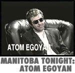
-
There's a director, Atom Egoyan
-
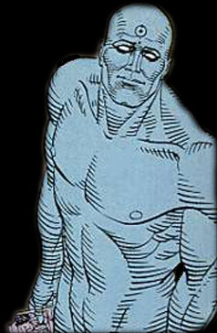
[FinnSmith, RefactorOk] As long as we're doing comic books... There's the character Dr. Manhattan from Watchmen. He has a hydrogen atom inscribed on his forehead. (He put it there himself after rejecting the three electron symbol the government came up with for him.) This is the best picture I could find on short notice.


1.4. Discuss
[NickChalko, RefactorOk] SVG version would be very nice, and make it easier to produce "correct" derivatives.
[JonathanSmith] Could anyone who worked on the project be able to buy a t-shirt?
-
Sure http://www.cafeshops.com/cp/ will print anything.
[MarkPilgrim] The ![]() Feed Validator needs a "Valid Atom" logo.
Feed Validator needs a "Valid Atom" logo.
-
[ArveBersvendsen] Will this do?
[MarkPilgrim] I would also like to see an Antipixel-style 80x15 "Atom Feed" logo, with a small icon of an atom and the word "FEED" in Silkscreen.
-
[ArveBersvendsen] Will this do?

[SimonJessey] All the work Arve has done is brilliant. His examples should be given serious consideration.
[TomasJogin] Let's not get ahead of ourselves. Just throwing around logotypes left, right and center will leave us in the same stupid corner as the RSS "logo" is in; oblivion -- there are so many RSS logos that there is no RSS logo. Let's reach a consensus on the name first, and then a consensus on the logotype.
-
[JeremyGray] I wouldn't be too worried about it at this point. Other than the prior art references, which are helpful, there have been (I think) only three fundamental treatments presented to date. There are far more (N)Echo/Atom feeds actually in production based on varying versions of EchoExample. Now that's something I'd be more worried about.